BRAND IDENTITY
BRAND IDENTITY
UX DESIGN / GAMING APP
Union Beyond Intuition
Union Beyond Intuition
"UBI" is a multidisciplinary cultural space in El Raval that brings together art, dance, events, and other projects such as a barbershop, showroom, tattoo booths, and pop-ups. Rather than a fixed location, it works as a living ecosystem where the people who inhabit it actively shape its transformation.
This project starts from a question: can the visual identity of a cultural space emerge through the participation of its users rather than being designed by a single author? To explore this, the project develops a flexible, participatory graphic identity system inspired by the rhizome, a structure that grows through connections, with no hierarchy or center, built collectively by those who inhabit the space.
TYPE:
Brand identity
TOOLS USED
Illustrator, Framer
ROLE
Brand strategy, identity design
For this project, I designed the key screens for Laurel Gaming, a mobile app of casual games. I focused on intuitive navigation and a clean aesthetic, making sure every interaction felt smooth and engaging.

La marca
La marca

The UBI logotype emerges from gesture and intuition. Handwritten type brings a human, organic quality; the monospaced subtitle balances it with clarity.
The symbol is a fragment of rhizomatic tissue, a section of an infinite network that extends beyond what's visible. Its branches don't end: they interrupt. Intentionally, because what lies outside the frame still belongs to the symbol. No center, no periphery, no beginning or end. The symbol stays open because UBI does too.
The UBI logotype emerges from gesture and intuition. Handwritten type brings a human, organic quality; the monospaced subtitle balances it with clarity.
The symbol is a fragment of rhizomatic tissue, a section of an infinite network that extends beyond what's visible. Its branches don't end: they interrupt. Intentionally, because what lies outside the frame still belongs to the symbol. No center, no periphery, no beginning or end. The symbol stays open because UBI does too.


Color Palette
Color Palette
The palette is built on warm, earthy tones that reflect the organic nature of the rhizome. A fourth option works as a soft background tone.
Pure red appears selectively as an accent, adding visual tension and directing the eye.
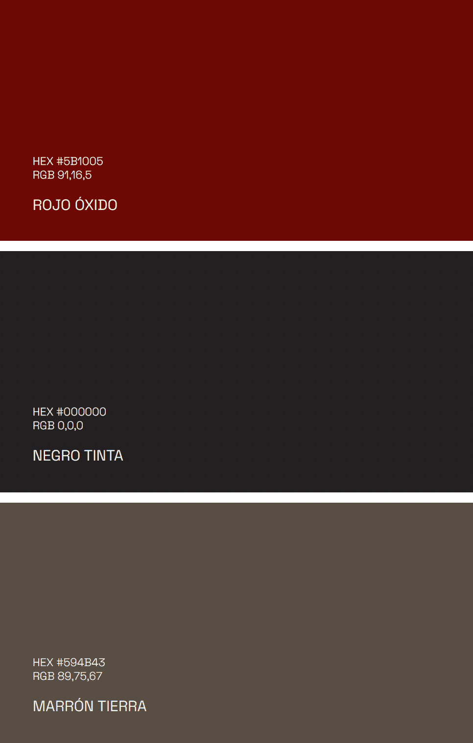
Oxide red is the most expressive color in the system: intense, characterful, and visually dominant. Ink black provides structural depth and contrast, with a conceptual link to graphic arts, ink, and tattoo. Earth brown brings warmth and materiality, a nod to craft and creative process.
The palette is built on warm, earthy tones that reflect the organic nature of the rhizome. A fourth option works as a soft background tone.
Pure red appears selectively as an accent, adding visual tension and directing the eye.
Oxide red is the most expressive color in the system: intense, characterful, and visually dominant. Ink black provides structural depth and contrast, with a conceptual link to graphic arts, ink, and tattoo. Earth brown brings warmth and materiality, a nod to craft and creative process.
Tipography
Tipography


Posters
Posters
UBI is a living identity, designed to transform without losing its essence. This flexibility is a statement of principle: a community that cannot be represented by a fixed image, because it never is one.
The first layer of flexibility lives in the symbol itself. Rather than a closed, protected mark, it's a starting point. Community members can intervene and generate their own version, making the brand grow from within.
The second layer is the rhizomatic tissue: the visual backbone of the entire identity. It appears across posters, applications, and communication pieces, always different in color, scale, opacity, and form. What remains constant is its logic: a network of connections representing disciplines as distinct as dance, tattoo, photography, or any other creative practice that makes up UBI. An identity that doesn't impose itself, but grows with the people who inhabit it.


The fanzine roots UBI in a specific cultural tradition. Born in 1970s punk culture as a self-managed communication tool, photocopies, staples, cheap paper, the format is chosen deliberately: UBI communicates through the same logic it stands for, with no institutional polish, just the energy of something alive.
Printed on newsprint and distributed by hand, each issue collects monthly events, workshops, open calls for pop-up brands, music picks, and cultural references. More than a calendar, a publication with editorial voice, where every issue captures the ecosystem at that exact moment. Each number adds another layer to UBI's visual and cultural archive.
The fanzine roots UBI in a specific cultural tradition. Born in 1970s punk culture as a self-managed communication tool, photocopies, staples, cheap paper, the format is chosen deliberately: UBI communicates through the same logic it stands for, with no institutional polish, just the energy of something alive.
Printed on newsprint and distributed by hand, each issue collects monthly events, workshops, open calls for pop-up brands, music picks, and cultural references. More than a calendar, a publication with editorial voice, where every issue captures the ecosystem at that exact moment. Each number adds another layer to UBI's visual and cultural archive.
Applications
Applications


UBI's digital presence spans Instagram and the website, both extensions of the physical space. Instagram works as a live visual archive, every post following the brand system.
The website expands the interactive layer: a personality quiz lets anyone discover their own symbol and join UBI's emerging identity from anywhere. One more node in the network.
UBI's digital presence spans Instagram and the website, both extensions of the physical space. Instagram works as a live visual archive, every post following the brand system.
The website expands the interactive layer: a personality quiz lets anyone discover their own symbol and join UBI's emerging identity from anywhere. One more node in the network.

The UBI logotype emerges from gesture and intuition. Handwritten type brings a human, organic quality; the monospaced subtitle balances it with clarity.
The symbol is a fragment of rhizomatic tissue, a section of an infinite network that extends beyond what's visible. Its branches don't end: they interrupt. Intentionally, because what lies outside the frame still belongs to the symbol. No center, no periphery, no beginning or end. The symbol stays open because UBI does too.
La marca
Color Palette
Tipography
Posters
The palette is built on warm, earthy tones that reflect the organic nature of the rhizome. A fourth option works as a soft background tone.
Pure red appears selectively as an accent, adding visual tension and directing the eye.
Oxide red is the most expressive color in the system: intense, characterful, and visually dominant. Ink black provides structural depth and contrast, with a conceptual link to graphic arts, ink, and tattoo. Earth brown brings warmth and materiality, a nod to craft and creative process.
The fanzine roots UBI in a specific cultural tradition. Born in 1970s punk culture as a self-managed communication tool, photocopies, staples, cheap paper, the format is chosen deliberately: UBI communicates through the same logic it stands for, with no institutional polish, just the energy of something alive.
Printed on newsprint and distributed by hand, each issue collects monthly events, workshops, open calls for pop-up brands, music picks, and cultural references. More than a calendar, a publication with editorial voice, where every issue captures the ecosystem at that exact moment. Each number adds another layer to UBI's visual and cultural archive.
The palette is built on warm, earthy tones that reflect the organic nature of the rhizome. A fourth option works as a soft background tone.
Pure red appears selectively as an accent, adding visual tension and directing the eye.
Oxide red is the most expressive color in the system: intense, characterful, and visually dominant. Ink black provides structural depth and contrast, with a conceptual link to graphic arts, ink, and tattoo. Earth brown brings warmth and materiality, a nod to craft and creative process.